The Influence of the Arts on my Writing (pt. 2)
What a Fine Arts education can impart on the written word
In Norway, you get to pick a certain specialization for your high school years which is a precursor to what you want to do afterwards. I chose something called “Drawing, Form and Colour” at a school in an edgy downtown district, so at age 15 I started making the half hour commute from my sleepy neighbourhood to this exciting environment of downtown.
Rather than say I did “Drawing, Form and Colour” I have tended to translate my experience here into “Fine Arts”, though I’m aware that the term typically also includes things like theatre and music. My version of Fine Arts tilts towards the Visual Arts then, which is also a more modern interpretation of the word.
I had a hard time keeping this letter short, and I’ve left out things which I’ll just have to cover in another letter one day. Nonetheless, here are some of the things I learned during my Fine Arts education that inform my writing.
Learn to draw what you see, not what you think you see

When drawing an object, it is common to mistake our idea of the object for how we see the object in real life. This means we draw from memory rather than draw by seeing the object in front of us, leading to very common mistakes of form and proportion on paper. My art teacher would appeal to us to see the object (often a basic shape, like a cylinder or a cube) with new eyes, like as if we had never seen it before. Study it like as if the form and its shadows were unfamiliar to us. Make no assumptions, and only draw what you see, not what you think you see.
Writing Lesson: You don’t know how your thoughts will sound on paper until you write it out. Writing is thinking.
Also, drawing what you see is enough
Related to the above point: Many years ago, in a conversation with my brother about being a creator, I heard the phrase from him: Document, don’t create. Yesterday I googled it and I was unsurprised to find that Gary V had written a whole thing about exactly this. It had very similar appeal to the exercise my art teachers taught me about drawing.
Writing lesson: if you want to be prolific and not stuck in your head, don’t try to create things from scratch. There’s stuff happening in your head right now. Draw/write from that.
Fix your blind spot by seeing the negative space
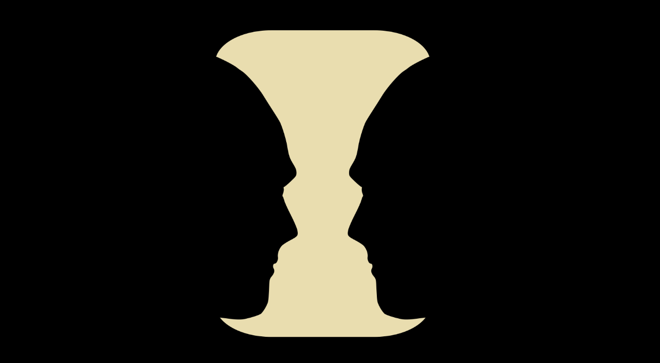
Strictly focusing on the boundary of the object often leads to the drawn result unintentionally getting misshapen and out of proportion, because we forget the boundary consists of two sides: the inside and the outside.
Look at any object in the place you find yourself in. There’s the object itself, then there’s the space around the object. Try to focus on the space around it, the negative space. What shape does it take on? Can you draw just that?
When I write, I think about this a lot. What am I focusing on? What am I leaving out of the picture? Am I missing something that would help tell the story? It’s a bit of ping pong with my mind but it helps me immensely. My intentions about what makes it in and what gets cut has all to do with driving the story home and keeping the audience engaged.
Writing lesson: There are many ways of remedying one-sided writing. For stylistic rounding, try some good old POP writing (which stands for Personal/Observational/Playful), or for topical rounding I will plug my very own letter on the Idea Compass🧭
Create drama on the canvas through composition
To generate interest, the piece needs a subject, a focal point.
Whatever the focal point is, there are a couple of locations on canvas that will leverage your focal point even more. The rule of thirds is generally a good guideline for object placement on the canvas, but is not the only way to place a subject on the canvas. Depending on what the focal point is and where it's located, it will need different types of support from the rest of the piece.
Writing lesson: Where and how you present your subject in a piece can alter reader retention and dramatic effect greatly. Try in the beginning, or at the end for mystery, or both, or spread out... think about how your point want to be presented. Tighten up parts that sag too much. If unsure, be obvious.
Use Contrast to make things stand out

It is one thing to capture the details of a subject immaculately through drawing or painting.
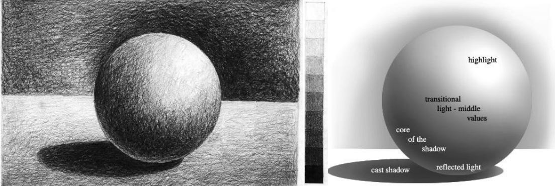
It’s a whole other thing to balance the “lightness”, or the light and shadow, of a picture for dramatic effect.
One of the first exercises we do in art school is to draw a gradient, like you see on the top of the image. You go from the very lightest of light scratches on paper, all the way to nearly breaking the pencil tip. That is the true range of your tool. Sometimes we use different “softness” of lead to create lighter or darker tones too. All of this contributes to the goal of creating as much depth in our drawings as possible.
Writing lesson: How can I create delight in my writing? In drawing, we use Size and scale, Dark and light, Close and far, Sharp and blurred… If a subject blends in too much with its surroundings, make it stand out through vocabulary, line breaks, bold/italics, kill some words to make snappy sentences... draw out a moment to change the pace. Create tension. Use the full range of the medium, and learn by observing how others do it too.
Use Tone to bring everything together
(There is a lot of practice that goes into drawing a subject, getting its form right, placing it nicely on the canvas, and applying the correct light and shadow, before getting to this point. So consider this the advanced level of drawing!)
The tone of a drawing influences its general aesthetic. Primary colour, pastel, neon, metallic, cool greytone…
Think about “colour tones” in video and movies. Think about the 80s “warm fleshy neon” vibe in Stranger Things or the cool sciency tones of movies like Arrival.
Use too many random colours and aesthetics and your piece will look messy and scattered. This is the magic of Instagram filters: pick a photo, then pick an aesthetic filter, and see the photo naturally come "together".
Writing Lesson: It’s super easy to colour correct and tone images with modern graphics tools, but for writing it must (unfortunately) still be done manually and it is hard work I tell ya. A rule of thumb: Don't change style, mood and pace too much in a written piece, or your text will be fragmented and the reader will feel confused.
This was a fun one to write! But do you know what was also fun about this edition?
This letter marks the 50th edition of Subject to Change! Except for skipping two weeks I’ve been publishing for one whole year! As I described a couple of letters ago, a year back coincides with just completing Write of Passage, and as per course instructions I was trying to figure out the prospect of publishing weekly, not knowing how I’d ever achieve this. Oof, it sure was stressful.
But look at you and me now. What a difference a year makes.
As always, thank you so much for reading. Give this letter a heart 💌 if you may and I’ll see you next week.
—Fei


"Document, don’t create" <- I will steal this with attribution and teach students
Congratulations on getting to 50 editions, Fei-Ling! Snuck that piece of news in, didn't you?!
I found this edition particularly valuable, and will be sticking in my special notes section. Adding mood to writing. Write from what you see, not what you think.
Each week I open your newsletter, and wonder - what will I learn this week?